Brief
Design a Drop-Ship App who want to sell products on Freeman Grattan Holding's websites, and for the people who manage the sellers that use that app.
My Contributions
- Research & Discover
- Ideation
- Information Architecture
- Product Design
- Visual Design
- Interaction Design
- Front End Development
Project Team
- Michael Wood User Experience & Front End Development
- Mike/Steve Agile Management
- Jenny Product Owner
- Graham, Kylie, & Shaun Back End Development
- Rizwan Testing
Process Overview
- Research
- Analysis
- Wireframing
- Prototyping
- Front End Dev
- UX Rework
- Back End Dev
- Wireframe
- Prototype
- Front End Dev
- Test
- Reiteration
- Deploy
Research & Discover
The Drop-Ship App project derived from an existing interface and set of processes which defined the functionality, allowing me to be able to focus on improving the experience by identifying and addressing pain points.
To discover those pain points, I conducted deep interviews with the suppliers who used the system. These interviews focused on the interactions Suppliers had with the system and the context of those interactions, as well as with the other similar systems they used.
These interviews were often a two stage process. Initially a subject would talk about the things they wanted but, when pressed, they would give clear priorities. Suppliers would detail a lot of features they wanted, but - when pressed - they would be absolutely certain about those they needed.
Suppliers were able to join in on workshops to feedback on the product as it was designed and built.
I also had ongoing access to Colleagues who managed Suppliers with the issues they had, and was able to use their insights as to shape the product as it was designed and built.
Key Insights
Suppliers had only limited time to post their products on the many platforms they used to sell. Suppliers would dedicate a similar amount of time to each platform and would work down from their most popular products, or the products which gave the best return.
And so the more difficult a platform was to use, the less product they would add to our system, and the less product we would have to sell, and the less depth of product we would have for customers.
Problem Statement
Suppliers would avoid using our system because it was more difficult to use than our competitors. This is a problem because it led to our offering a smaller inventor or having a less up-to-date manifest leading to fewer products for sale and out of date stock information, leading to less sales and more refunds
Colleagues who had joined the business in the decade after it was launched, and who did not have legacy relationships with Suppliers, relied on the system reporting notifying them of issues which could be detected from usage rates but had previously been discussed in personal relationships. This was a problem because it caused Colleagues to seem less interested in the Supplier relationship than had previously been the case, leading to a deterioration of that relationship.
All users experienced an out of date system which required IT Support to maintain older Windows 7 machines to operate legacy code based. This was a problem internally for cost, and externally in that suppliers wanted to maintain their manifest using modern devices, which the code did not support.
Ideation Phase
- An open workshop with Suppliers about what they want, and expect, from a Drop-Ship App, leading to a time analysis of how the suppliers work.
- A workshop with Colleagues to leverage the domain knowledge they have, and find out how they use their time.
- Journey mapping of the main use cases for the Drop-Ship App.
- Interactive session to map, and propose, journeys for the new Drop-Ship app.
- Wireframes and Prototype sessions with feedback and interactive improvements.
The Concept
A Drop-Ship App which is so easy to use that Suppliers will tell Amazon what we do right, not the other way around.
Convincer
Pitch Visuals
Personas
Wireframes
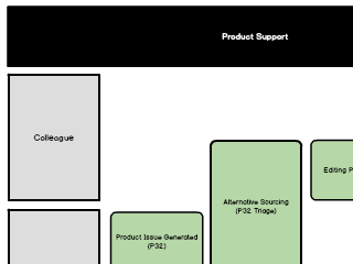
 The process from wireframe to design to build.
 This process highlighted the need for flexibility.
 The views had a level of information to share.
 But that information changed depending on Supplier.
 So a quick switching of views was important to us.
 And Suppliers were keen to move away from a one-size-fits all approach.
Visuals
Tone of Voice
User Testing
Identified key metrics around the time spend to achieve the same tasks, and the errors and mistake which came from tasks. Tracking those metrics and AB testing improvements for them was crucial in development.
Features
- An app with a new, faster interface. This makes better use of our Supplier's most precious resource, their time.
- An app which works across device. This will allow Suppliers to use the app from anywhere.
- An app which reports better. This will allow our Colleagues to have deeper relationship with Suppliers.
Outcome
- Colleagues reported finding the system easier to use, and timesheet tracking suggested they were spending four to five hours less a week while maintaining the same work levels.
- Suppliers reported satisfaction and usage of the system increased, albeit slightly, against a backdrop of declining use for non-Amazon systems.
Final Thoughts
The key piece of research in this project that it was time and not money that was the most significant resource for suppliers. The better we used a supplier's time, the more product they would upload, and the more profit we would make.


